# 组件嵌套
可嵌套其他组件的组件叫做布局组件也叫容器组件,组件嵌套与组件通信是组件高复用的前提条件,
组件嵌套功能避免了设计重型业务组件,极大的减少大粒度组件存在。
TIP
布局组件另一个价值体现在布局能力上,实现 PC 端页面的组件化搭建。
# 编写布局组件
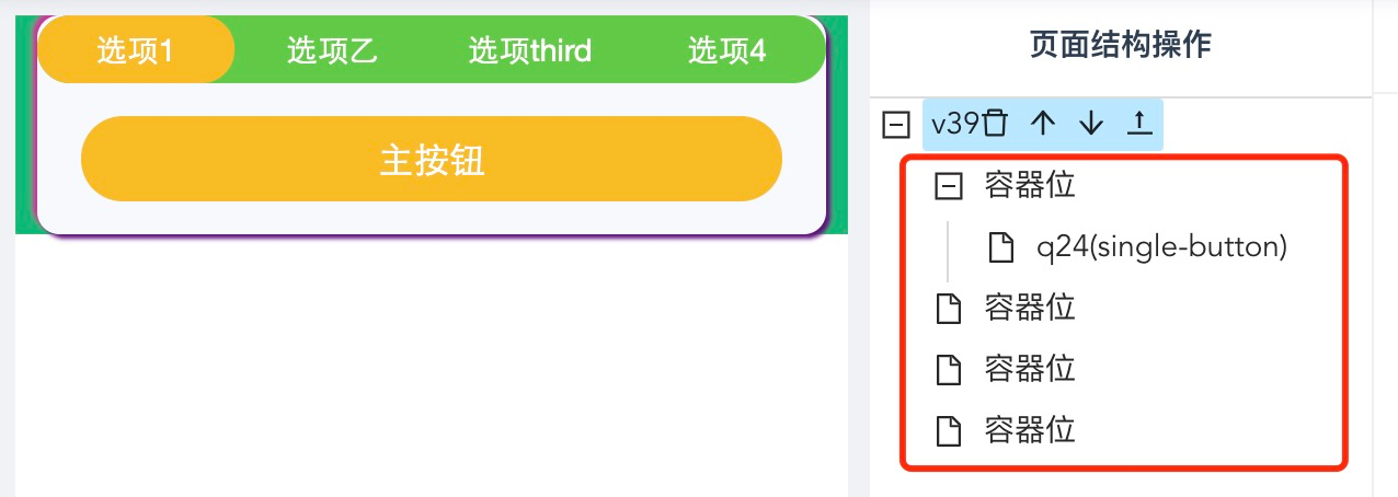
以Tabs 组件为例,设计一个可调整 Tab 数量且最多支持 4 栏的 Tabs 组件,其拥有 4 个插槽位。JSON Schema ↓
{
  "title": "组件编辑",
  "type": "object",
  "required": [],
  "properties": {
    "tabNum": {
      "title": "tab 个数",
      "type": "integer",
      "minimum": 2,
      "maximum": 4,
      "default": 3
    }
  }
}
# Tabs 组件 Vue 版
插槽必须命名,哪怕只有一个,这里只展示部分源码 ↓
<template>
  <div class="tab-container">
    <ul class="tab-list">
      <li
          class="tab-item"
          v-for="(item, index) in tabNum"
          :key="index"
          @click="clickTab(index)"
      >
        {{ index }}
      </li>
    </ul>
    <div class="tab-content" v-show="activeIndex === 0">
      <slot name="one"></slot>
    </div>
    <div class="tab-content" v-show="activeIndex === 1">
      <slot name="two"></slot>
    </div>
    <div class="tab-content" v-show="activeIndex === 2">
      <slot name="three"></slot>
    </div>
    <div class="tab-content" v-show="activeIndex === 3">
      <slot name="four"></slot>
    </div>
  </div>
</template>
# Tabs 组件 React 版
React 没有 slot 概念,约定通过 props.children 接收子组件,children 是一个 key => children 子组件列表的集合。
function App(props) {
  const {
    children = {},
    tabNum,
  } = props;
  const [activeIndex, setActiveIndex] = useState(0)
  const childrenName = ['one', 'two', 'three', 'four']

  return (
    <div className="tab-container">
      <ul className="tab-list">
        {
          (new Array(tabNum)).fill(0).map((item, index) => {
            return (
              <li
                className="tab-item"
                key={index}
                onClick={e => clickTab(index)}>
                  {index}
              </li>
            )
          })
        }
      </ul>
      <div className="tab-content">
        {
          children && children[childrenName[activeIndex]]
        }
      </div>
    </div>
  )
}
# 布局组件 JSON-Schema
布局组件为何能接受到子组件,子组件又是怎样被编辑进去?
在发布组件时,slot字段用来申明布局组件的插槽位信息,值是以逗号拼接的插槽位名字,如one,two,three或者... 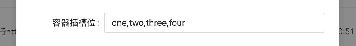
当编辑组件时,结构操作区会自动展开其插槽位,为添加子组件提供了交互解决方案。
# 动态列表插槽位
以上 Tabs 组件被限制了最多有多少个 tab,这种限制也是对业务的一种约束。
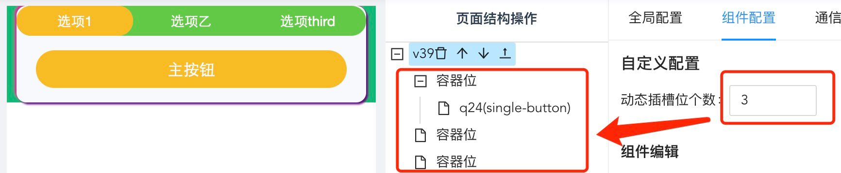
在提到布局组件注册的slot字段时,值可以是...,表示插槽位个数不定,没有插槽名,它是一种列表形式的插槽位描述。
 当布局组件的
slot字段值为...时,组件的编辑面板会额外有一个调整插槽位个数的控件,
调整该值会直接影响树结构中该组件的插槽位个数,最终影响传递给该组件的子组件数组长度。
此时,Vue 版本的 Tabs 组件 Template 部分改为 ↓,该 Tabs 组件的插槽位个数不再有约束。
<template>
  <div class="tab-container">
    <ul class="tab-list">
      <li
          class="tab-item"
          v-for="(item, index) in children"
          :key="index"
          @click="clickTab(index)">{{ index }}</li>
    </ul>
    <div class="tab-content">
      <component v-if="children && children.length" :is="children[activeIndex]" />
    </div>
  </div>
</template>
提示
布局组件提升了组件复用度,同时将组件化页面搭建的能力延伸到 PC 端。
可以设计为布局组件的场景有:轮播组件、滑屏交互组件。
← JSON-Schema 组件通信 →